CSS3的Flex布局實例教程
作者:維易PHP培訓學院 時間 2017-06-10
《CSS3的Flex布局實例教程》要點:
本文介紹了CSS3的Flex布局實例教程,希望對您有用。如果有疑問,可以聯系我們。
相關主題:CSS2和CSS3特效
你會看到,不管是什么布局,Flex往往都可以幾行命令搞定。
我只列出代碼,詳細的語法解釋請查閱《Flex布局教程:語法篇》。我的主要參考資料是Landon Schropp的文章和Solved by Flexbox。
一、骰子的布局
骰子的一面,最多可以放置9個點。
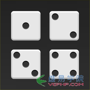
下面,就來看看Flex如何實現,從1個點到9個點的布局。你可以到codepen查看Demo。
如果不加說明,本節的HTML模板一律如下。
<div class="box">
  <span class="item"></span></div>
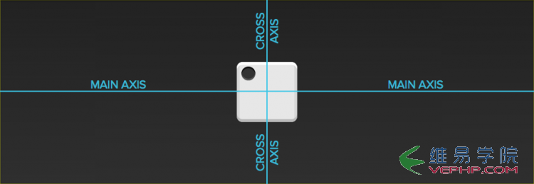
上面代碼中,div元素(代表骰子的一個面)是Flex容器,span元素(代表一個點)是Flex項目。如果有多個項目,就要添加多個span元素,以此類推。
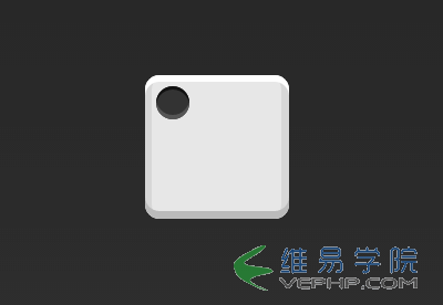
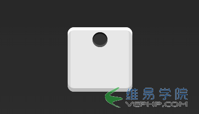
1.1 單項目
首先,只有左上角1個點的情況。Flex布局默認就是首行左對齊,所以一行代碼就夠了。
.box {
  display: flex;}
設置項目的對齊方式,就能實現居中對齊和右對齊。
.box {
  display: flex;
  justify-content: center;}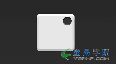
.box {
display: flex;
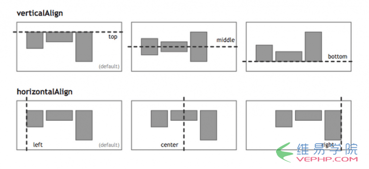
justify-content: flex-end;}設置交叉軸對齊方式,可以垂直移動主軸。
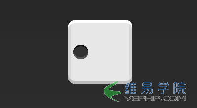
.box {
  display: flex;
  align-items: center;}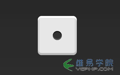
.box {
  display: flex;
  justify-content: center;
  align-items: center;}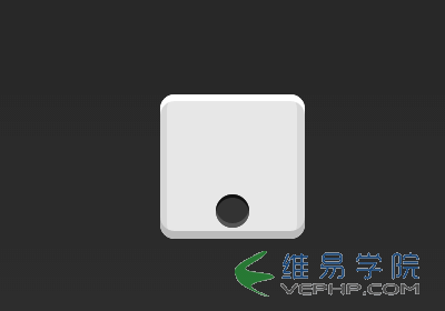
.box {
  display: flex;
  justify-content: center;
  align-items: flex-end;}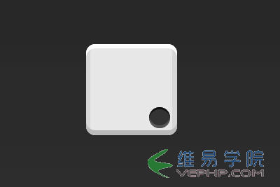
.box {
display: flex;
justify-content: flex-end;
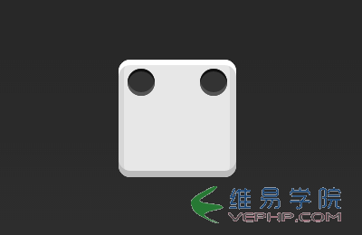
align-items: flex-end;}1.2 雙項目
.box {
  display: flex;
  justify-content: space-between;}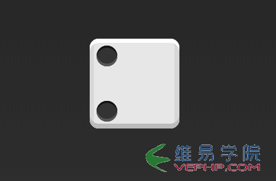
.box {
  display: flex;
  flex-direction: column;
  justify-content: space-between;}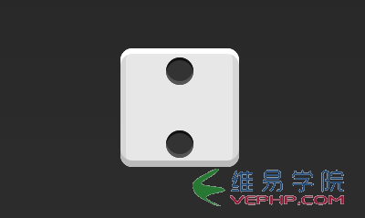
.box {
  display: flex;
  flex-direction: column;
  justify-content: space-between;
  align-items: center;}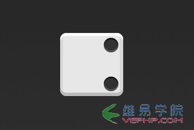
.box {
  display: flex;
  flex-direction: column;
  justify-content: space-between;
  align-items: flex-end;}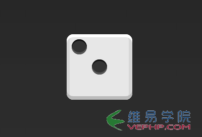
.box {
  display: flex;}.item:nth-child(2) {
  align-self: center;}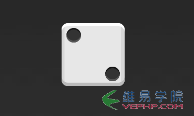
.box {
display: flex;
justify-content: space-between;}.item:nth-child(2) {
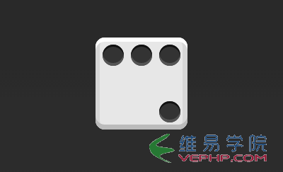
align-self: flex-end;}1.3 三項目
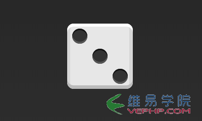
.box {
  display: flex;}.item:nth-child(2) {
  align-self: center;}.item:nth-child(3) {
  align-self: flex-end;}
1.4 四項目
.box {
  display: flex;
  flex-wrap: wrap;
  justify-content: flex-end;
  align-content: space-between;}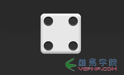
HTML代碼如下。
<div class="box">
  <div class="column">
    <span class="item"></span>
    <span class="item"></span>
  </div>
  <div class="column">
    <span class="item"></span>
    <span class="item"></span>
  </div></div>
CSS代碼如下。
.box {
  display: flex;
  flex-wrap: wrap;
  align-content: space-between;}.column {
  flex-basis: 100%;
  display: flex;
justify-content: space-between;}?